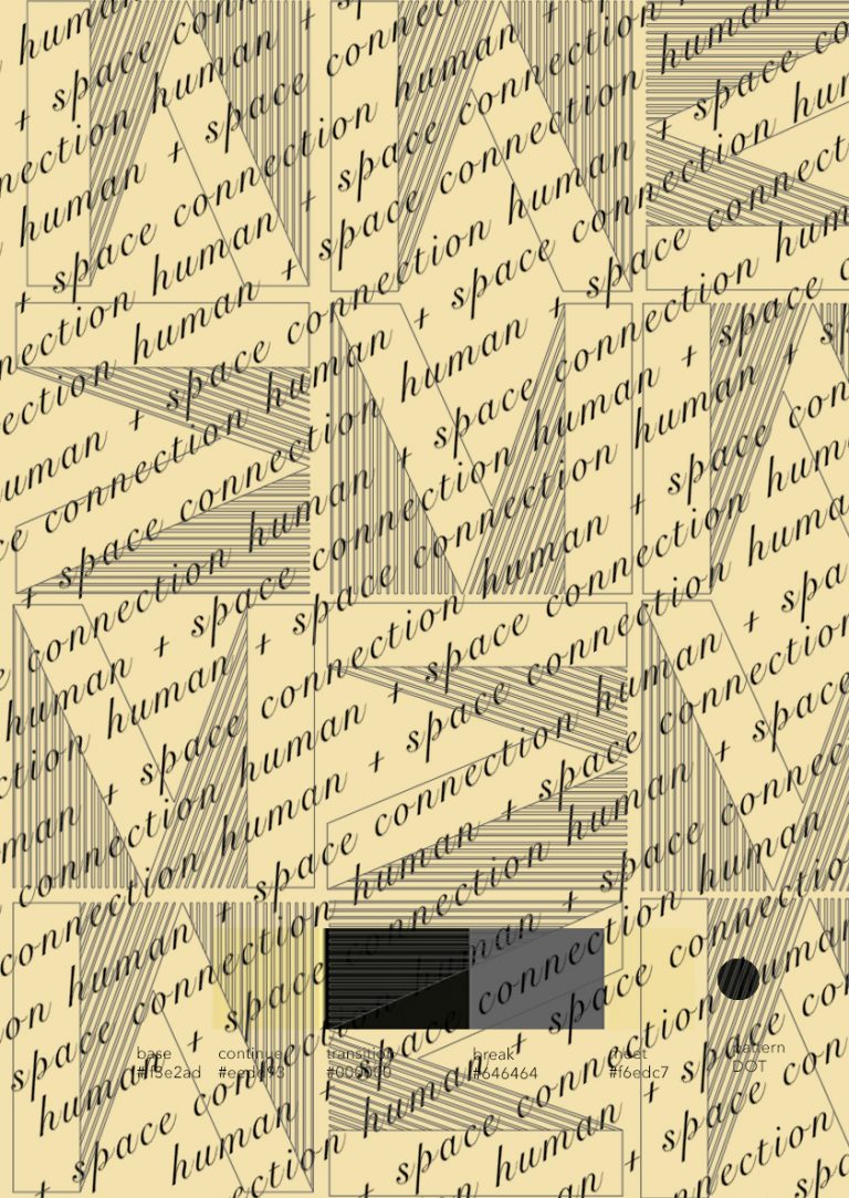
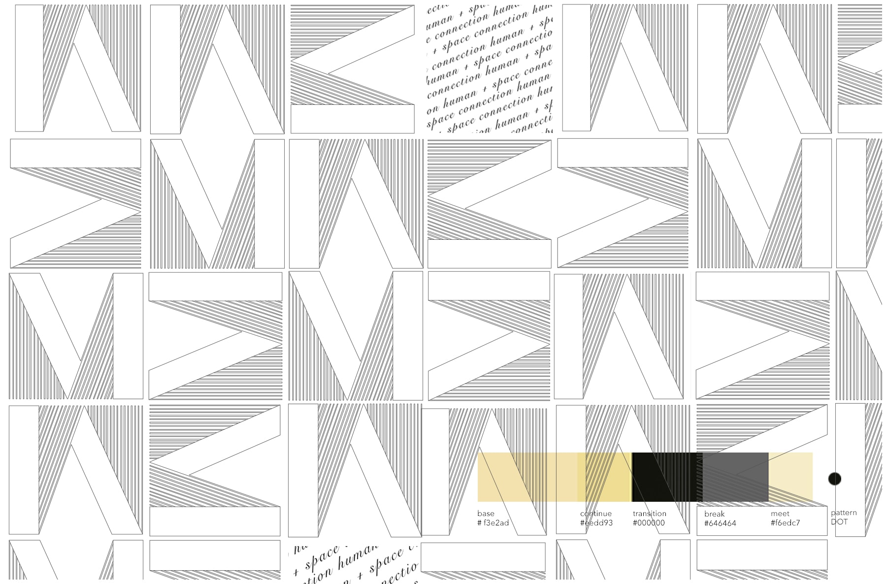
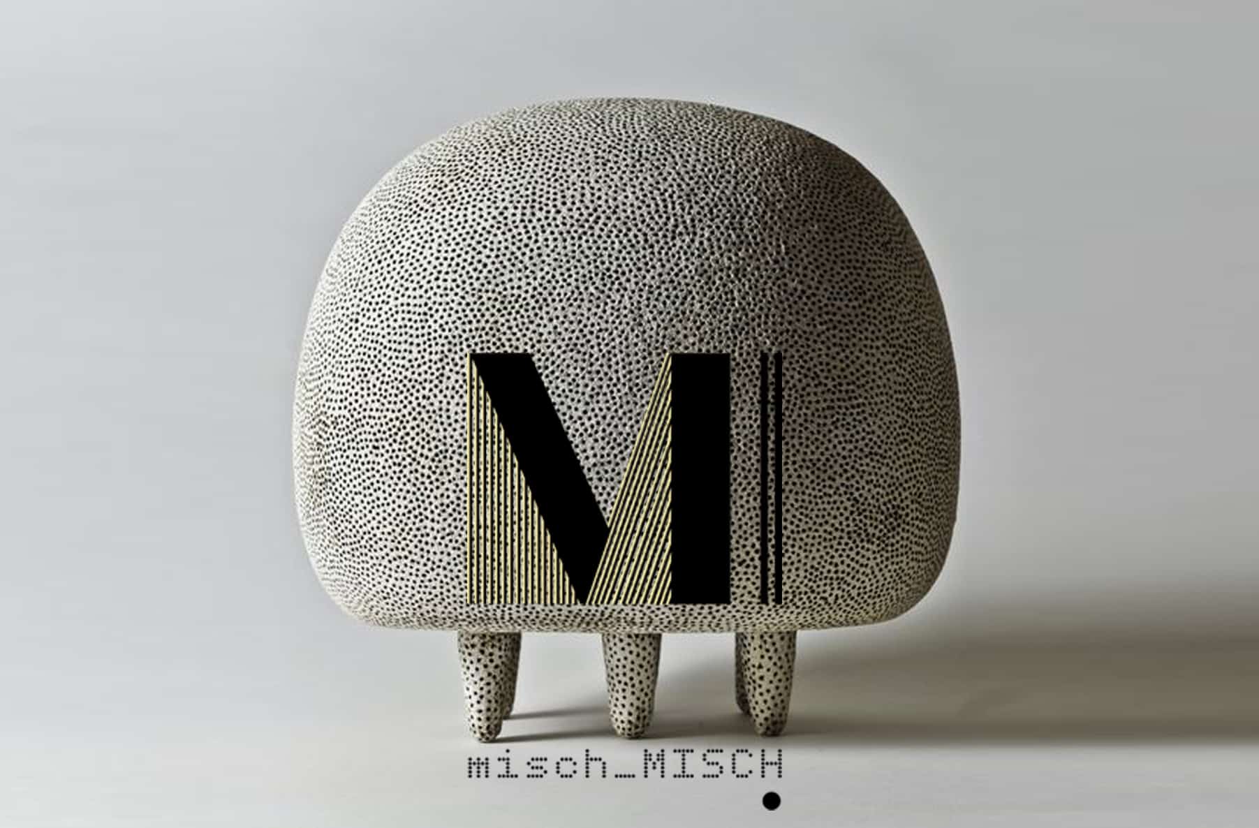
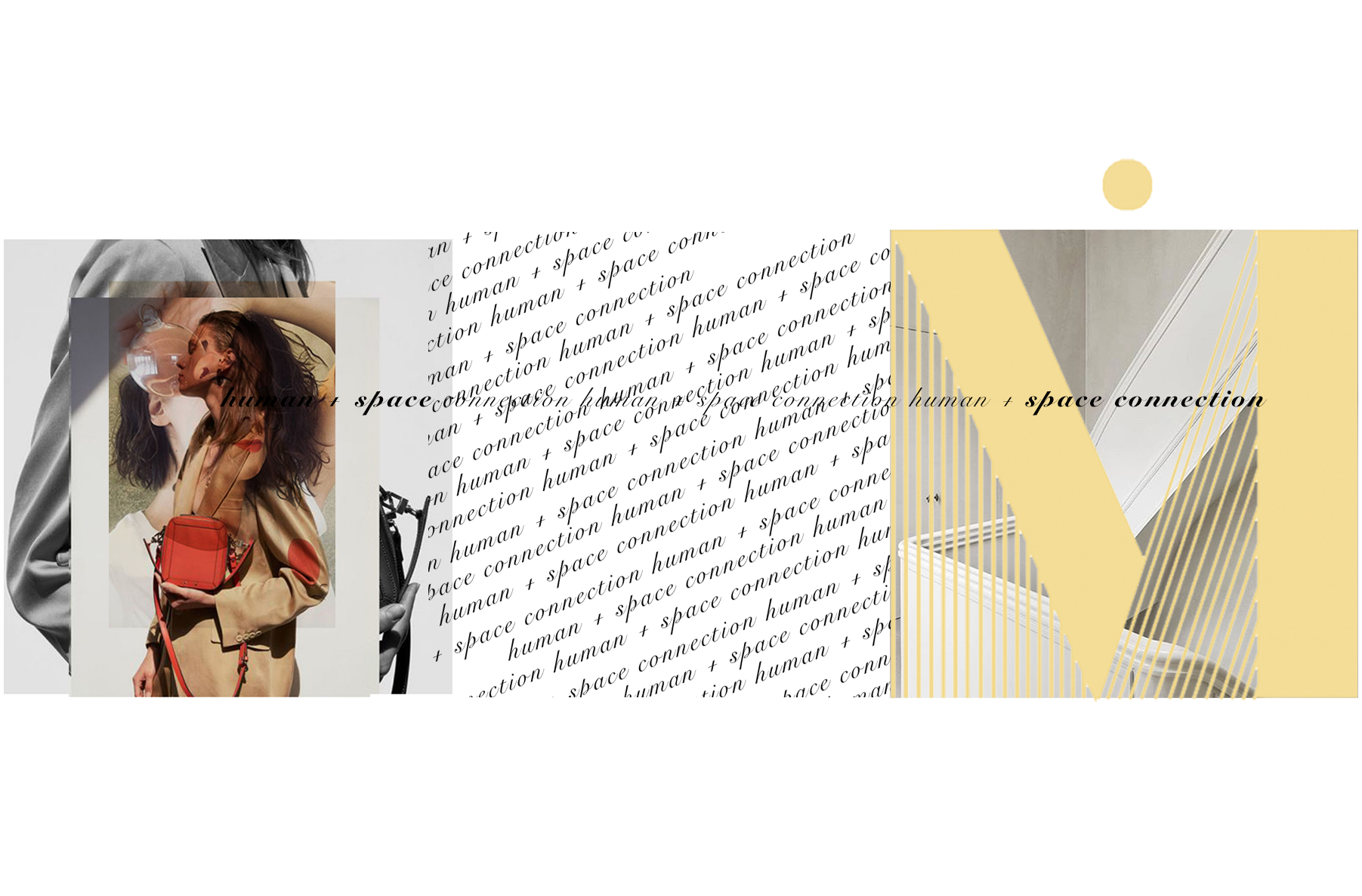
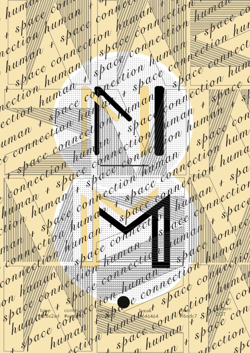
• HOME
  • PROJECTS
  • the.STUDIO
    • about. US
    • our. SERVICES
    • the. TESTIMONIALS
  • CONTACT.us
  • PRESS
  • STORE
    • COMING SOON
  • ARTICLES
Menu
  • HOME
  • PROJECTS
  • the.STUDIO
    • about. US
    • our. SERVICES
    • the. TESTIMONIALS
  • CONTACT.us
  • PRESS
  • STORE
    • COMING SOON
  • ARTICLES
  • HOME
  • PROJECTS
  • the.STUDIO
    • about. US
    • our. SERVICES
    • the. TESTIMONIALS
  • CONTACT.us
  • PRESS
  • STORE
    • COMING SOON
  • ARTICLES
  • HOME
  • PROJECTS
  • the.STUDIO
    • about. US
    • our. SERVICES
    • the. TESTIMONIALS
  • CONTACT.us
  • PRESS
  • STORE
    • COMING SOON
  • ARTICLES

mM

BUSINESS IDENTITY

N1C

  • size: ∞ft²
  • area: London_Worldwide
  • project: VISUAL IDENTITY
  • style: Business Identity | Classic | Mid Century Modern

the. STORY

Solely founded out of its Creative director’s desire to connect people with [+] their spaces as the ultimate embodiment of the testimony of what tailored environments to one’s daily rituals represent. From which the #humanspaceconnector was born out. 

Resulting in project delivery where two are never like, but one-off as its owners are. Free of a house style in the conquest to create spaces that defy trends.

LUXURY IS THE OPPORTUNITY TO EXPERIENCE QUALITY AND YOUR DREAM OF PERFECTION

mM

daily. RITUALS

Here the team loves to push each other the be better and are pumped every day with enthusiasm to collaboratively create, invent and resolve solutions to deliver detail focused luxury interior design, interior architecture and styling curations.

It is those explorations that make the end results worthwhile. When the client who seeks considered homes walks into their space with a distinctive impression, continual surprise and delight – the studio’s job is done.

HUMAN AND SPACE CONNECTION AS THE ULTIMATE DREAM OF LIFE BALANCE

mM

JUXTAPOSITION

The brief was to portray the studio’s values and the multi-faced iconoclastic aesthetics it exercises. Reflective of the ever present distinctive balance between contrast and cohesion, vintage with cool modernity, an electric juxtaposition of the luxury and ordinary, bold and subtle.

The challenge was to portray the infusion of the brand’s self-confidence against its playful side without being compartmentalised. The result is the quietly exuberating sophistication, cool demure and expressive elegance of Arte Deco.

unique. POINTS

Each identity element represents an equally important story. The ‘misch_MISCH’ derived from the founder’s nickname ‘meeschy misch’ while the purposeful placement of capital away from the begging is for non-conformity and unwillingness to be compartmentalised, nor to attain to one design style.

Dotted font for small parts that form a successful project. Tied back with the rigid geometry of the logo, and the elegant mix of pure black, light grey and ivory-peach colours.

business brand visual identity by misch_MISCH studio london
Contrast project
business brand and identity by misch_MISCH london
you might like

LETS WORK TOGETHER

Every project starts with the conversation.
Tell us your dream project
SAY HELLO

ALL PROJECTS 

  • ARTICLES
  • PRESS
  • CONTACT
  • Privacy

Be Social

  • INSTAGRAM
  • PINTEREST
  • FACEBOOK
  • LINKEDin

SAY HELLO!

[email protected]
[+44] 078 0942 1690
[+44] 020 7424 8513

‘EVERY SPACE TELLS A STORY AND WE WOULD LIKE TO TELL YOURS’

SUBSCRIBE TO DISCOVER OUR STORIES

© misch_MISCH 2022